
The Working Mommy’s Manual Brand Expansion
2025–
Project Categories
• Thumbnail Design • Video Editing • Motion Graphics •
Tools Used
• Adobe Illustrator • Adobe Photoshop • DaVinci Resolve • Affinity Designer • Canva •
Client
The Working Mommy’s Manual Podcast, hosted by Nicole Corning & Kathleen Wilson
The Working Mommy’s Manual Podcast was looking for an expansion of their branding to attract more viewers across a range of social media platforms. I was contracted to begin uploading video recordings of their episodes to a new YouTube channel that I set up on their behalf. On this channel, I established and built on their existing logo and font guidelines a new hub for forthcoming episodes. This included designing new video thumbnails for each episode, A/B testing title formats, continually iterating on visual styles, and establishing clear description layouts to streamline cross-platform navigation, better position the podcast, and attract increased audience viewership.
Below you may find examples of visual style iterations used on video thumbnails, the more recent motion graphics I designed for the video intros and outros, as well as links to the YouTube channel, newly designed website, and Linktree hub for other important links.
youtube.com/@TheWorkingMommysManual | TheWorkingMommysManual.com | linktr.ee/WorkingMommyManual
Video Thumbnails
Iteration 1
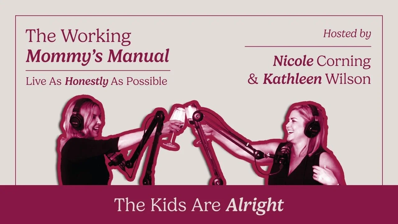
The first iteration was based directly on the existing logo imagery that the brand used, expanding the size to fit video dimensions and adding a snapshot of Nicole & Kathleen from the episode. It also maintained the color palette previously established.
Iteration 2
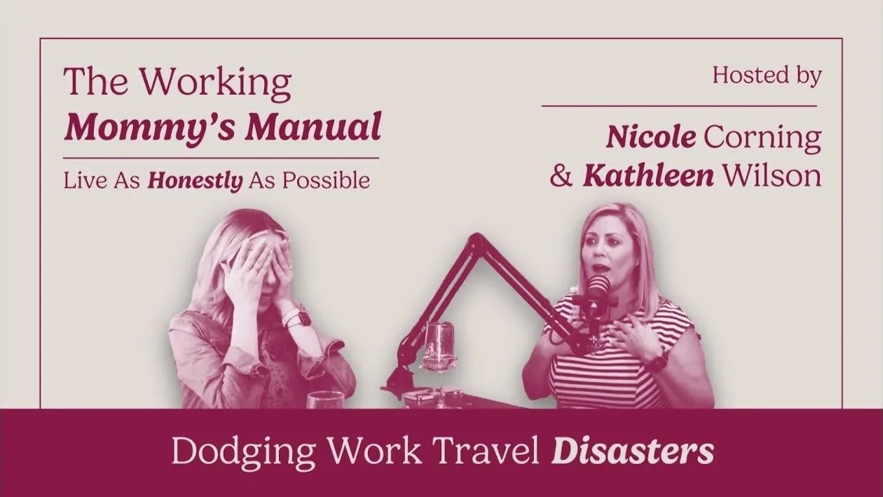
The second iteration remained similar, taking away the stroke around each image of the hosts and only using the colored tint. This iteration was coined while using Canva and implemented their duotone features, but didn’t change much in terms of layout.
Iteration 3
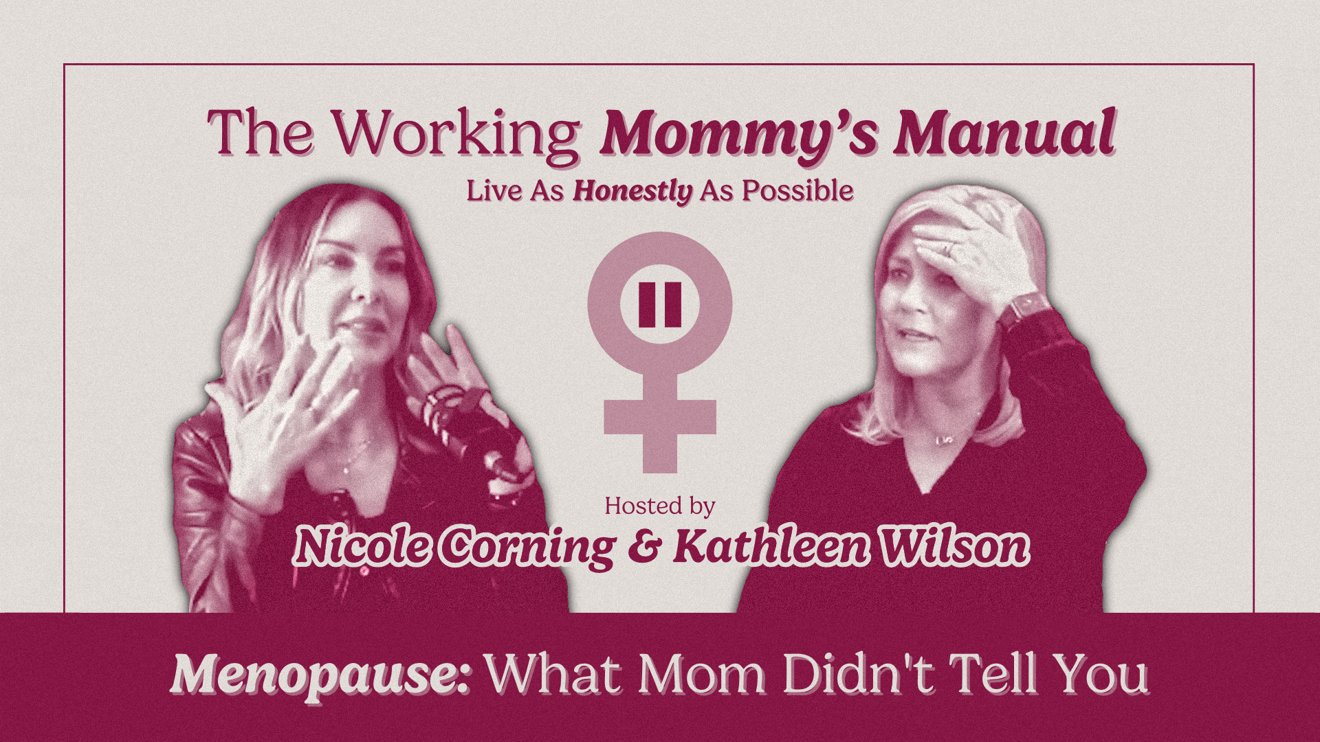
The third iteration maintained the same visual base, but in order to better emphasize the images of the hosts, they were made larger and the rest of the text was reorganized. A graphic relating to the specific topic discussed was also added for each episode.
Iteration 4
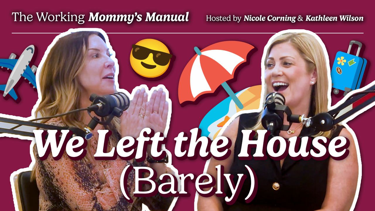
The most recent iteration completely switched up the visual style, opting for a more dynamic and engaging layout. The color background was made dark and the images were not tinted to increase contrast and readability, with the episode title and topic given priority.
The most recent iteration has given a noticeable increase in viewership, allowing me to use this viewer data to more accurately understand audience reception.